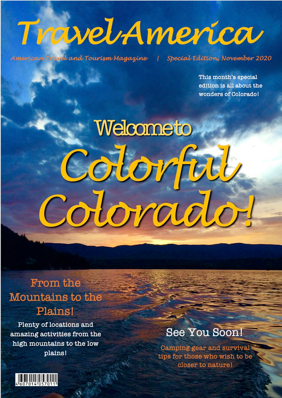
 For the final magazine cover, I changed the main title and some of the other small text around it. I made the "Welcome to" a lighter shade of yellow than "Colorful Colorado!" because I did not want that area to be too bold and take the attention away from everything else. I changed the locations for some of the smaller texts so they will easier to see among the picture in the background. I kept the same font because I have always thought it was very pretty and matched my magazine well. However, I took away the text that said "Go where you feel most alive!" because I feel that it does not match the rest fo the magazine and stood out too much. Overall, I feel that the final cover has a simplistic look to it, but is still very attractive.
0 Comments
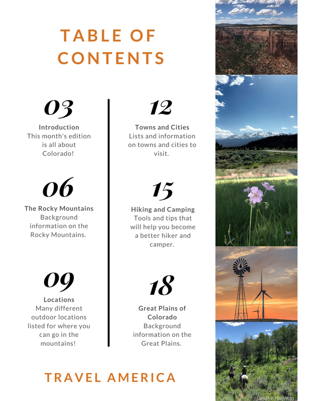 For the final table of contents, I kept most things the same. However, I did add a line separating the page numbers and descriptions, and I rearranged the order that the go in. I felt that the way I had it done before was a bit confusing, so this was a way to make it easier to look at an understand. I kept the pictures, text, and colors the same because I was already very confident in what I had created.
 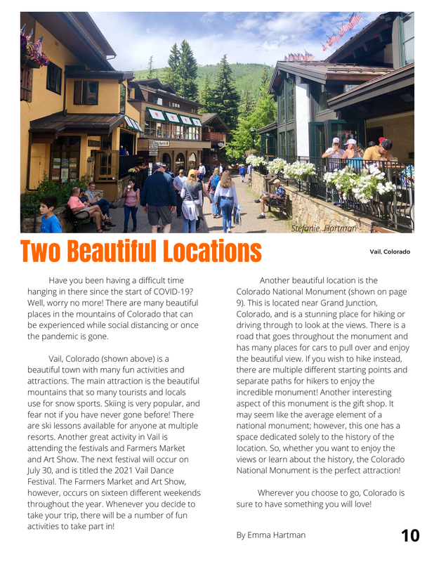 For the double page layout, I did not change anything on the first page, but I changed some on the second. I edited the paragraphs and writing to make it less crowded and took out the section that I felt was not as important and did not go with the rest of my magazine. I also changed the title and the font that it was in. I had to change the title to fit the text, but I changed the font because I felt that it looked better with the pictures and pages that I had. I kept the same pictures on both pages because they of the locations that I had discussed in the text. I was very confident and happy with the overall look before, so I just made small changes to what I felt needed it to make it look more organized and attractive.
|
ArchivesCategories |
 RSS Feed
