|
Possible article topics that I can have for my table of contents page are tips on camping, ways to stay safe in the wilderness, possible things to do while visiting Colorado (or the specific location mentioned), camping and hiking gear that will be helpful on outdoor adventures, and any local towns/cities and restaurants and stores there that the readers could possibly go to to eat or explore local places. 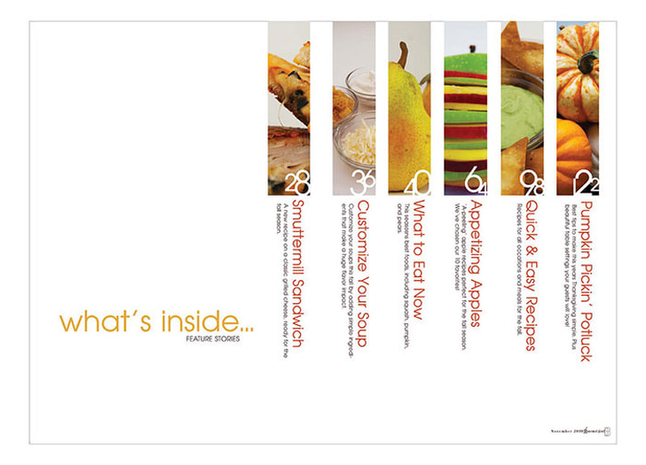 I chose this table of contents (TOC) layout because I think that it very unique and I have never seen a TOC page like this one. There are places for pictures as well as titles and small descriptions of what the page will be about. It is a horizontal page, which does not match my magazine cover; however, after I edit it and make it vertical as well as adding my own images, texts, font, etc. then I believe that it will match my front cover page and look really well in the magazine. I love the way the images and article titles are set up. 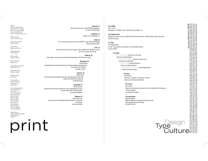 This TOC layout is very intriguing to me because, like the first one, it is very unique. I think the shape the words begin to form is very interesting and would look really cool with my front page. However, there are no pictures and I think that having pictures on the TOC page is very important. There is also a lack of color, so I would have to add some more color and possibly add some images as well. 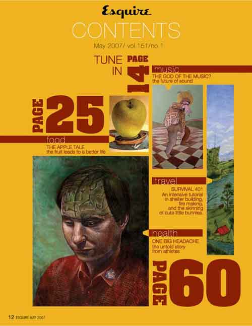 I chose this TOC layout because there are multiple pictures as well as article titles and small descriptions about them. The titles and page numbers are placed in a very interesting format that I really like. I also like how the page numbers are the largest font size on the page and the article titles are the second largest (after the "CONTENTS" title), which draws the readers eyes to them. Everything works well together in this layout. I would definitely change the colors, images, and fonts to match my front page better, but overall I think that they would work together very well.
0 Comments
Compare/contrast: The notes of the example scored exam and my notes are very similar. Both notes are short and simple; however, they are structured differently. The example notes have a heading that whether it is notes on the mise-en-scene, editing, camera, or sound, while my notes just have the first letter of what its about next to it. The notes themselves are also quite similar. They talk about some similar things, but the example notes go more in depth with the camera angles and lighting, while my notes focused more on the feelings that those aspects created in the viewers. I also do not have many notes about the lighting, while the example notes do. The write up from the example scored exam and my write up are set up quite different as well. The example write up has many different paragraphs where it talks about how all of the different aspects work together but also about the affects that they have on their own. My write up has only five paragraphs where I discuss the affect of everything as a whole in the beginning, and then go into the different aspects in their own paragraphs. They both discuss what was written down in the notes and they both discuss the singular elements as well as the whole. Just like in the notes, the example write up goes more in depth on the different elements, such as the camera angles and lighting, while I focused more on the feelings the elements give off. I did not explain as much about the characters or lighting and how the different elements affect them, while the example write up did. I also added some about foreshadowing that was possibly occurring and how that affected the mood. My write up: This scene in the show Fargo provides the viewer with information that helps them understand what is happening at that moment, but not enough to where they know what is going to happen next. It has some foreshadowing, such as Lester practicing opening the door with his gun and then a knock on the door, but the viewer does not know who the person at the door is or what is going to happen next. The camerawork, sound, mise-en-scene, and editing help add to the suspense and anxiety that is being portrayed through the scene. The camerawork helps show many different things. By switching between Lester and Pearl's faces during their argument shows their facial expressions, feelings, and reactions to what the other person is saying. This helps the viewer to better understand what is going on through their heads. The camera also showed Lester looking in one direction and then the camera switched to show the hammer, which implies that he is looking at the hammer and is thinking about it. The same thing happens with the poster after he hits Pearl with the hammer. While Lester is hitting his wife with the hammer, the camera is not showing her at all but shows the blood splatter on the wall. This helps show that she is getting seriously injured by the hammer. While Lester is taking off his clothes and trying to hide the evidence, the camera is switching to many different locations to show and increase the level of anxiety that is getting passed from Lester to the viewers. The sound in the scene also helps the viewers understand it better. There are many different sounds in the video that show many different things. First, there is sound while Lester is fixing the washing machine, which helps bring it to life more. There is also a lot of rattling while the washing machine is breaking to help the viewer see that it is breaking without anyone in the scene actually saying it is breaking. There is also a gruesome sound while Lester is hitting Pearl in the head with the hammer. The second hit sounds really loud to show that she was hit very hard. After she fell and was being hit multiple times, you do not see Pearl at all, but you do hear her being hit which implies that he is killing her and it is causing much damage to her. There are some scenes where there is no background music, which helps the viewer focus more on what is happening in the scene, such as Lester hitting Pearl with the hammer. However, there are other scenes where there is background music, such as Lester waiting for the person he called to get to his house, which increases the level of stress and anxiety. The mise-en-scene also adds a lot to the scene. The decor of the house looks very comfortable and cozy when Pearl first walks into the house; however, as she goes downstairs, the basement looks very dirty and empty. This helps set the scene for what is about to happen in the basement. The posture of the actors also helps add to the scene. Pearl is standing with her arms crossed, which shows that she is annoyed with Lester and is also very sassy. Lester is moving around a lot and looks very uncomfortable and nervous while talking to Pearl. His body movement while he is on the phone implies that he is very anxious and stressed out. Lester's new outfit after he kills Pearl gives him a new look. He looks clean and professional, which could possibly be to make it more believable when/if he tries to blame someone else for the murder of his wife. The editing also helps set the mood for the scene. The rattling, shaking, and smoking of the washing machine helps imply that the washing machine is breaking without anyone actually saying that it is. There is also a lot of blood in the scene. The blood falling down Pearl's face after she originally gets hit with the hammer helps show how injured she is from the hit. The blood splattering while he is hitting her also helps show how injured she is, as well as the pool of blood and blood all over her face. The lighting in the house is very dim, which helps add to the feelings in the scene. It creates a suspenseful and dark feeling, which relates to what is happening in the scene. There is also some foreshadowing. Lester is seen taking his gun and opening a door to practice how he is going to open the door when the person he called before arrives. There is also a knock on the door right when he finishes practicing. This leads the viewers to believe that once the person arrives, he is going to try to blame them for what happened to his wife. Although there is foreshadowing, it does not mean that it is actually going to happen. My notes:
 The masthead is the title of the magazine. It suggests what the magazine is going to be about, in the case of my magazine, it is about traveling America. The mood that is suggested by the color of the letters is that it is very warm. The colors of the letters is similar to the colors in the picture so that it is easy to look at and the colors don't stand out too much, but don't blend in either. The masthead is the biggest size because it is what people should be looking at first so they know what the magazine will be about. The other words are smaller because although they are important, it is not as important as the masthead. They give insight on what the magazine will be about, so if someone is drawn to the magazine by the picture or the masthead, they can read the smaller text to know what that edition will be about. The shape of the larger words are in a cursive font because it makes the magazine look good. I love cursive font and I think that it looks really good with my magazine. The cover I chose is a picture from when I went fishing in the Colorado mountains. It has a variety of different colors in the sunset, but overall it is a little dim. There are no humans in it because the magazine is about places in America to travel to, so it is only of a certain location. The image is meant to show the reader a beautiful scene in Colorado that will make them want to read the magazine to learn more about it and want to go visit that location. The strapline is "Welcome to Colorful Colorado." This suggests that the magazine is going to be all about Colorado and places to go and things to do there. The rhetoric features that are evident are the smaller text that is meant to be little teasers. They give away some ideas that are going to be discussed in the magazine, such as different locations. The most notable linguistic features are the masthead as well as the strapline. They are meant to draw the reader in and want to read the magazine, so they are the biggest and are in the most noticeable places on the cover.
|
AuthorWelcome to my Media Studies Blog! I am a senior at Monarch High School in Coconut Creek, Florida. I am taking AICE Media Studies so I can receive the Cambridge Diploma. Enjoy! Archives
April 2021
Categories |
 RSS Feed
