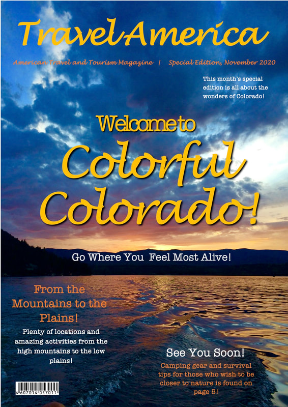
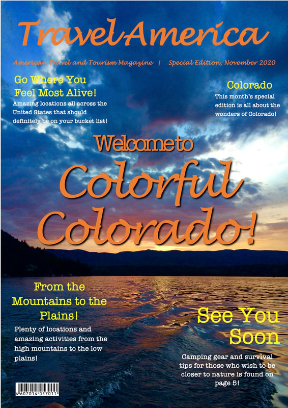
  The first image is the revised magazine cover and the second is the original. I changed the color of the title because I felt the orange was a bit too bold. I put shadows under the title as well to make it stand out more. I added text that says "Go where you feel most alive!" because I feel that it matches the theme of the magazine and will attract the target audience. I also changed the color of the smaller text around the magazine because I feel that it goes better with the colors that are around it in the background.
0 Comments
Leave a Reply. |
AuthorWelcome to my Media Studies Blog! I am a senior at Monarch High School in Coconut Creek, Florida. I am taking AICE Media Studies so I can receive the Cambridge Diploma. Enjoy! Archives
April 2021
Categories |
 RSS Feed
